
ANTOYA KOREAN BBQ
Korean BBQ Restaurant : Menu Consulting & Re-Design (Dinner / Lunch)
*Mobile viewers, please turn your device to landscape.


Problems
-
Overly red-toned menu images
Inconsistent typography (poor harmony between Korean, English, and Chinese)
Irregular photo sizes & angle
Unclear which items are key products or which ones the store wants to promote
Disorganized categories & layout
Meaningless intros and illustrations that seem forced in just to increase page count
-
Overly red-toned menu images
Text layout that doesn’t harmonize with photo sizes
Menu appears overly crowded
Inconsistent typography (poor balance between Korean, English, and Chinese)
Awkward paper size seemingly adjusted to fit the menu layout
-
Clean and sophisticated menu design
Better visibility for key products
Increased the variety of lunch menu options
⬇︎


Solutions
-
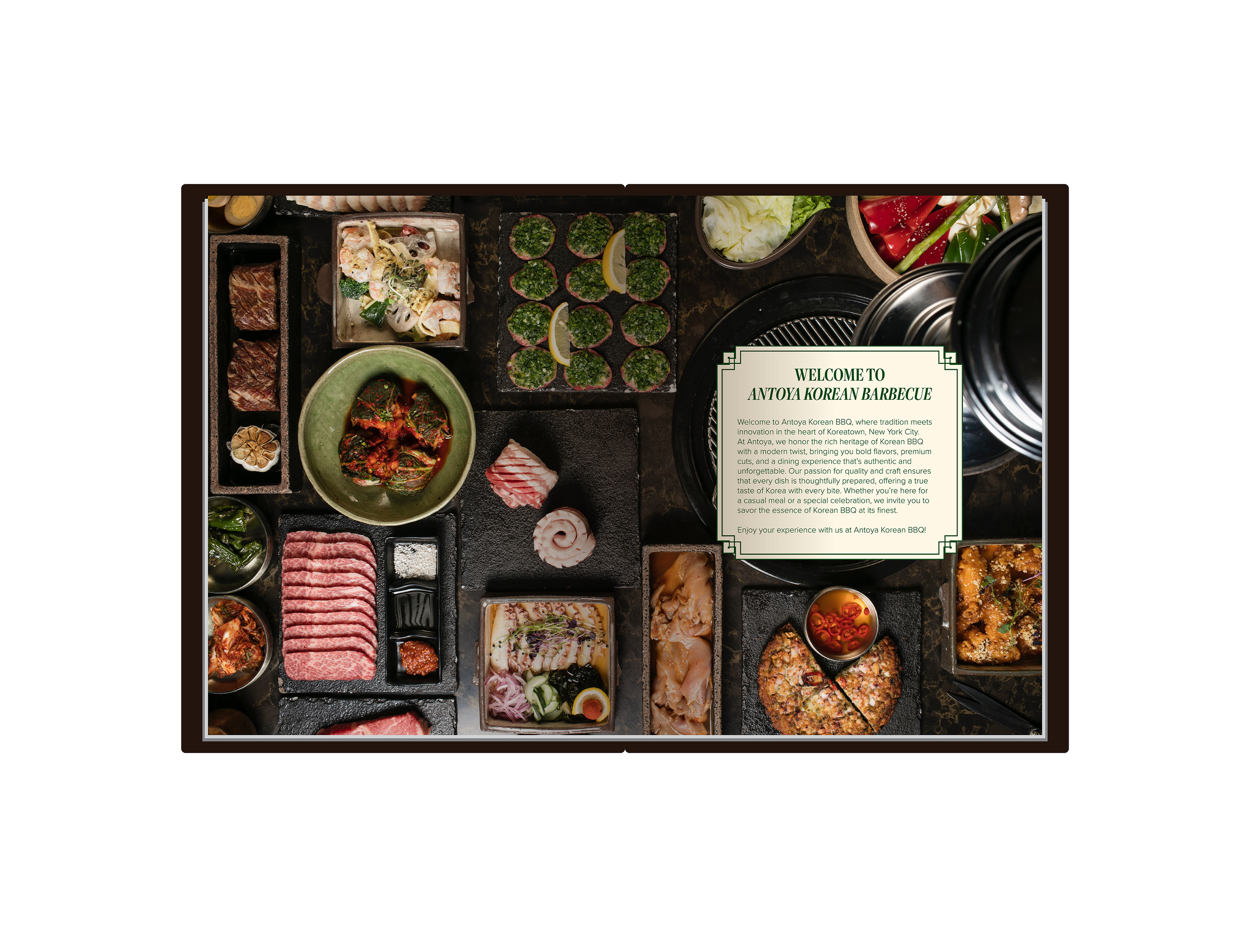
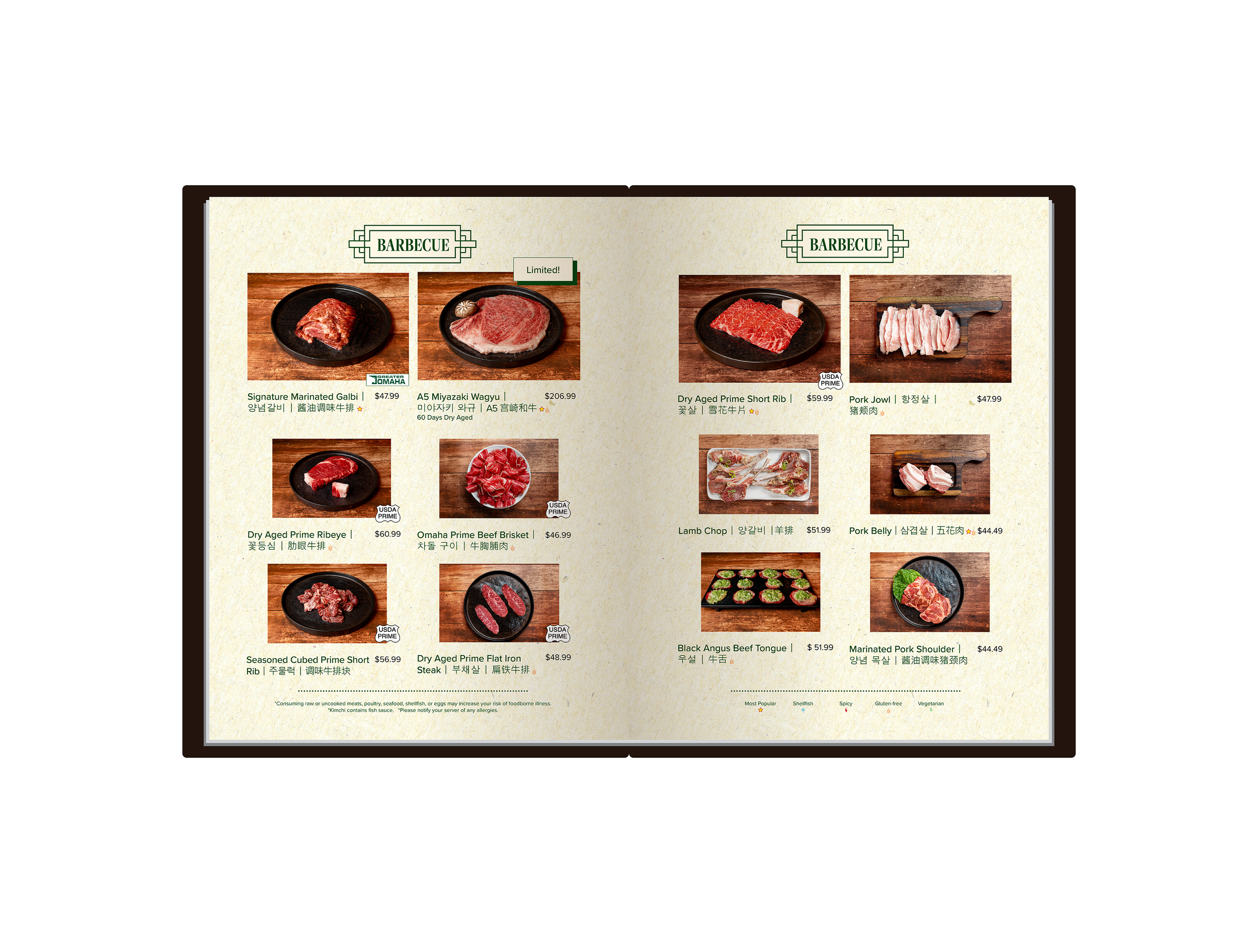
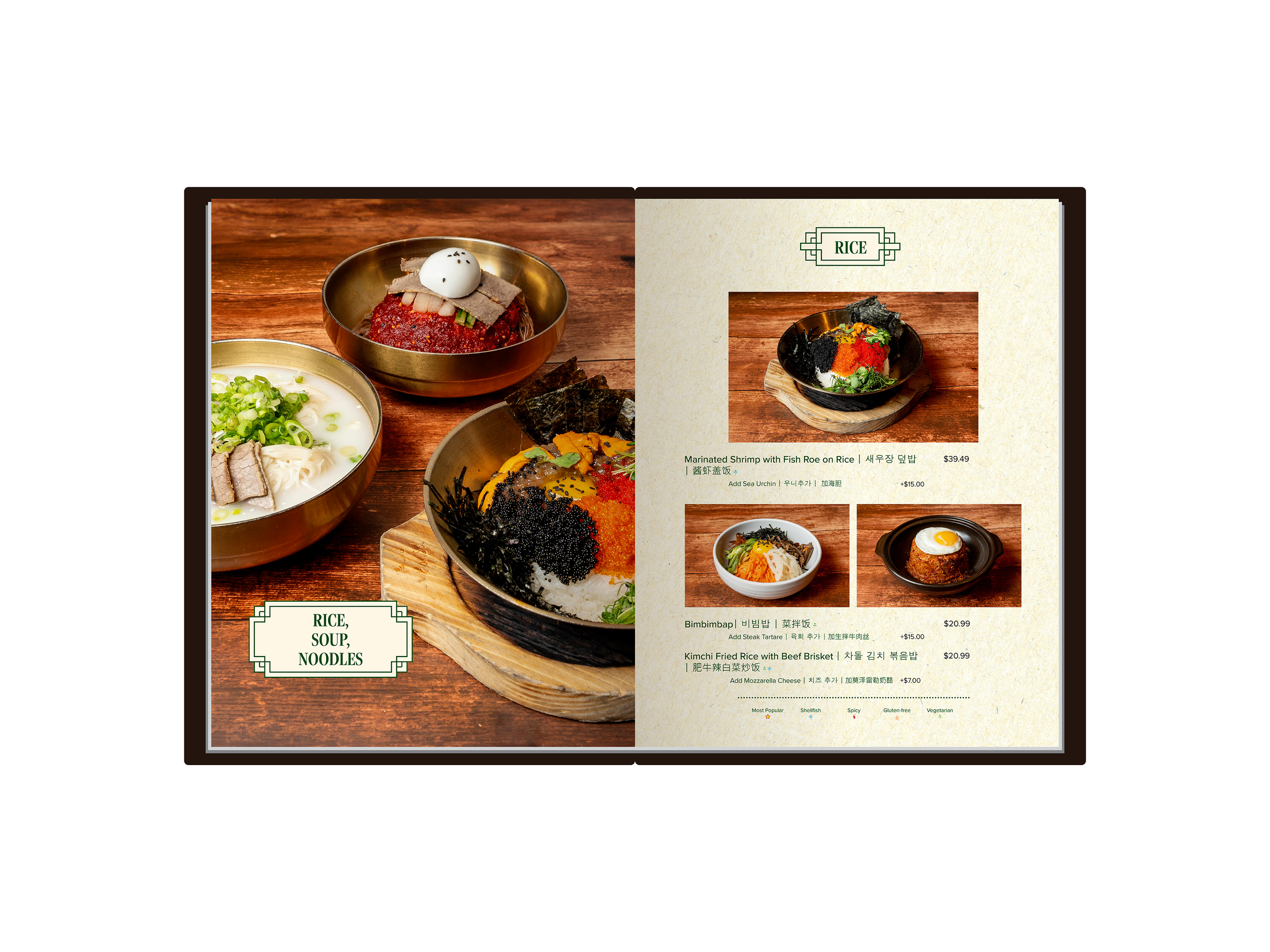
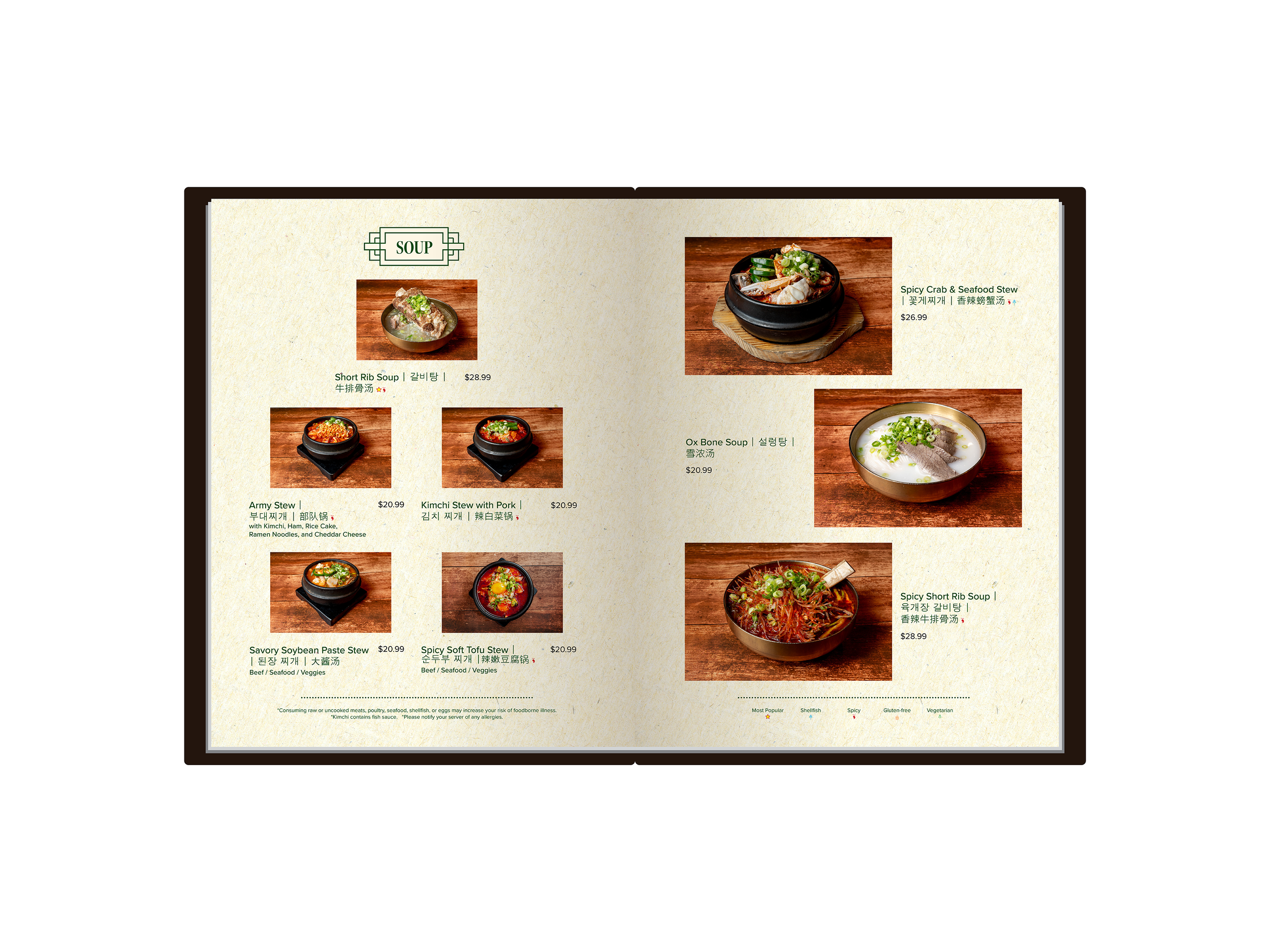
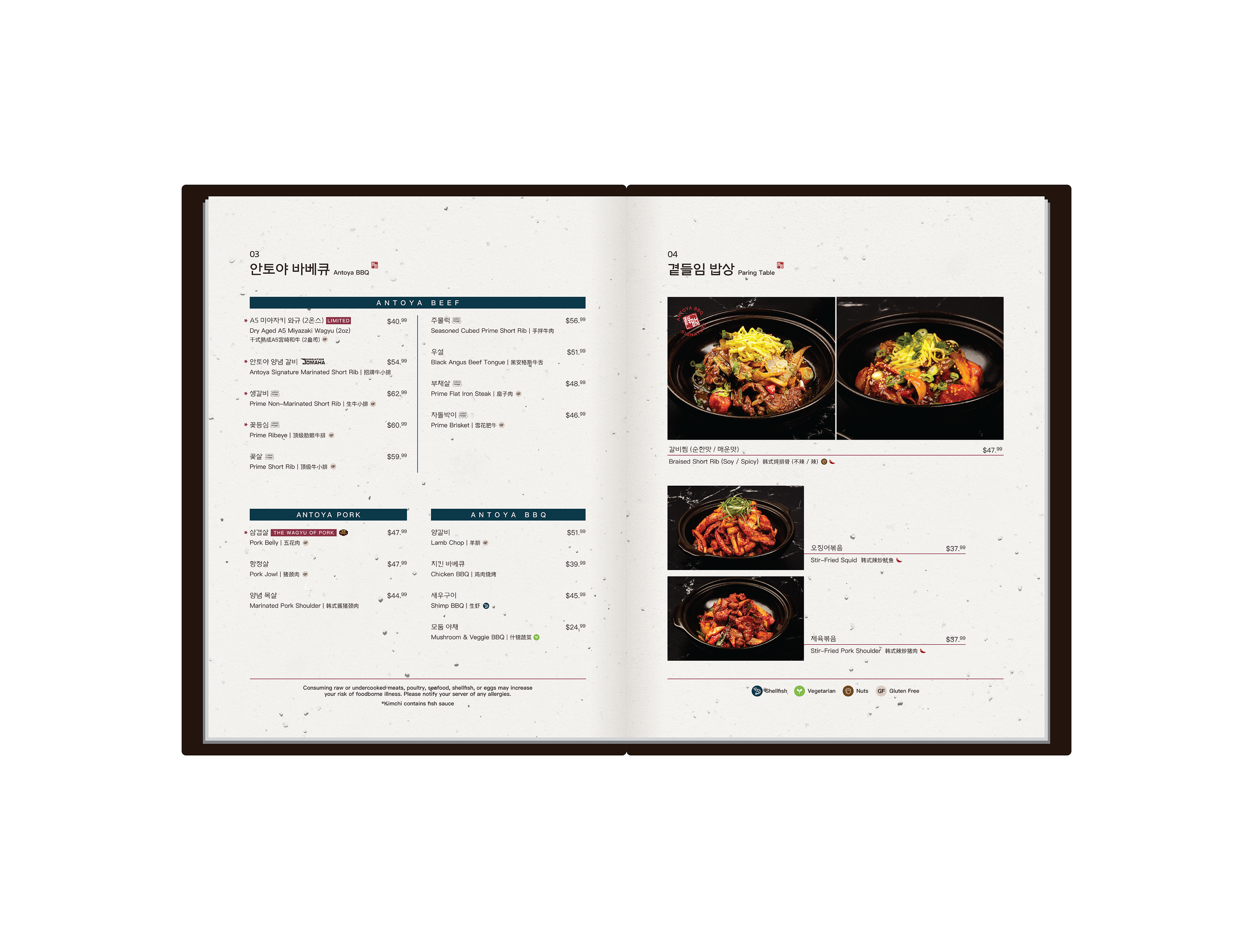
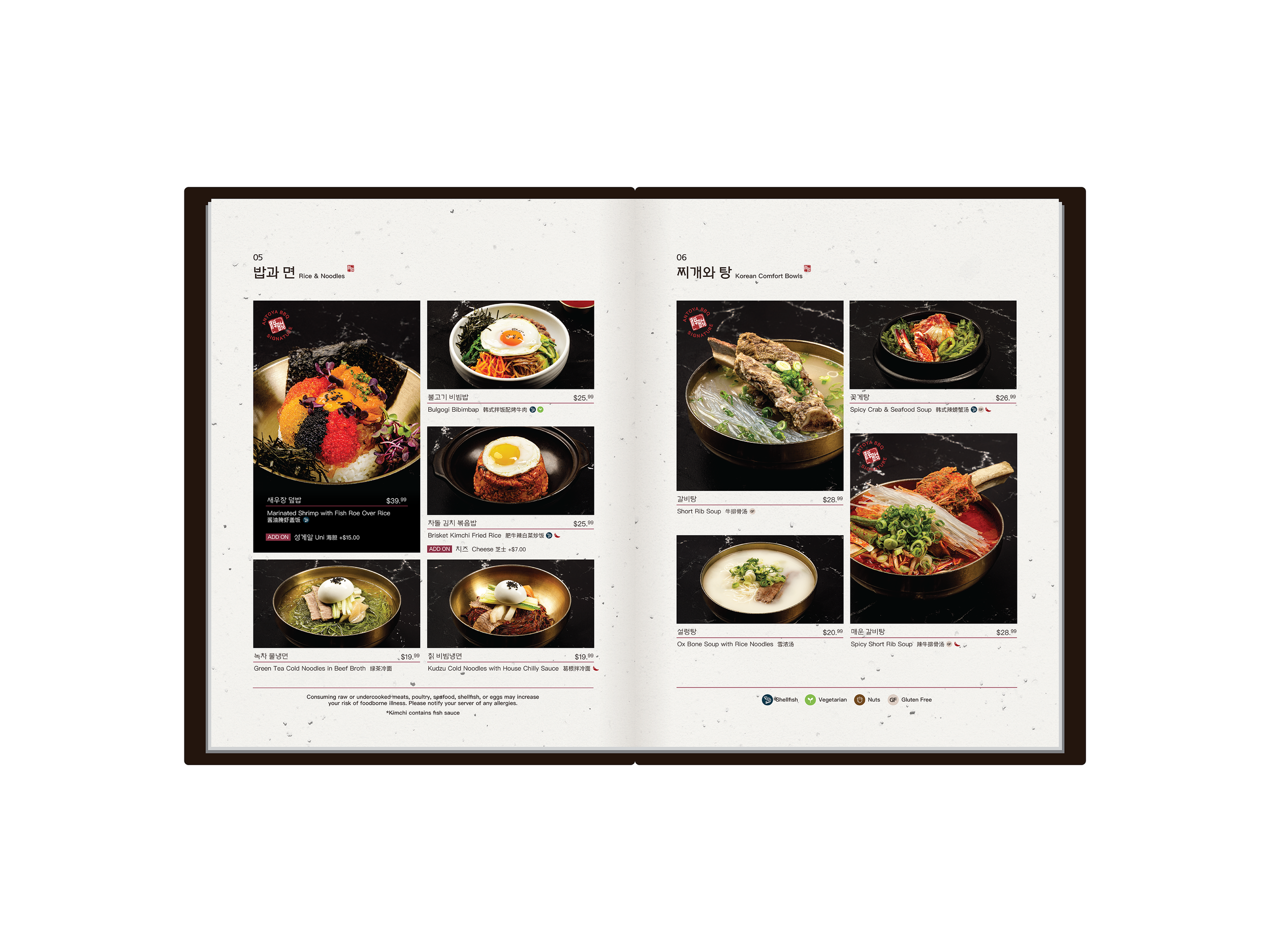
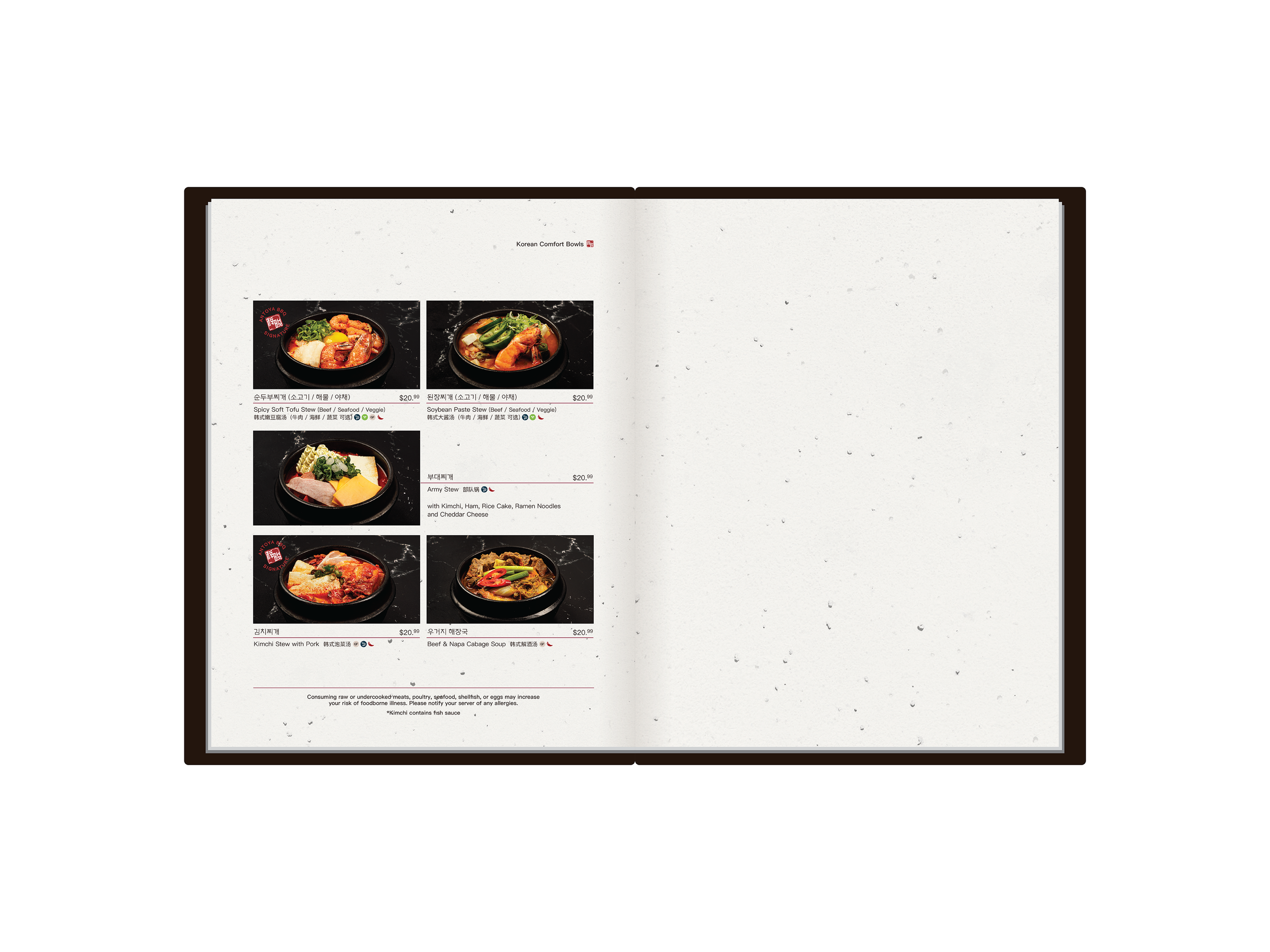
Full menu reshoot: Directed with dark backgrounds and focused lighting on the food, minimizing yellow and red tones to make dishes appear crisp and clear. For items served in similar dishes, consistent angles were used to create a cohesive look across the menu.
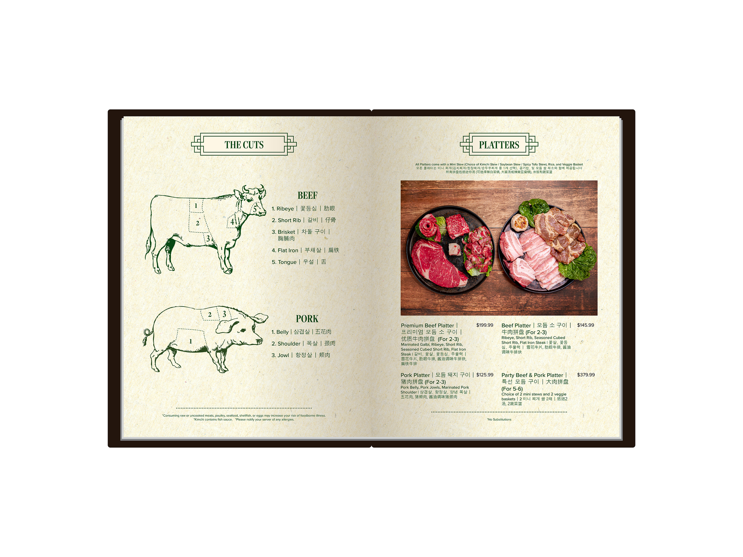
Organized menu into 6 categories: Appetizers, BBQ, Mains, Rice & Noodles, and Soups.
Selected Korean, English, and Chinese fonts with a similar style. Used rounded sans-serif typefaces for a clean and sophisticated look.
Placed key products and items the store wants to promote at the top of the menu, enlarging their images to draw immediate attention.
Used a stamp icon labeled “Antoya BBQ Signature” to make key products immediately recognizable to customers.
-
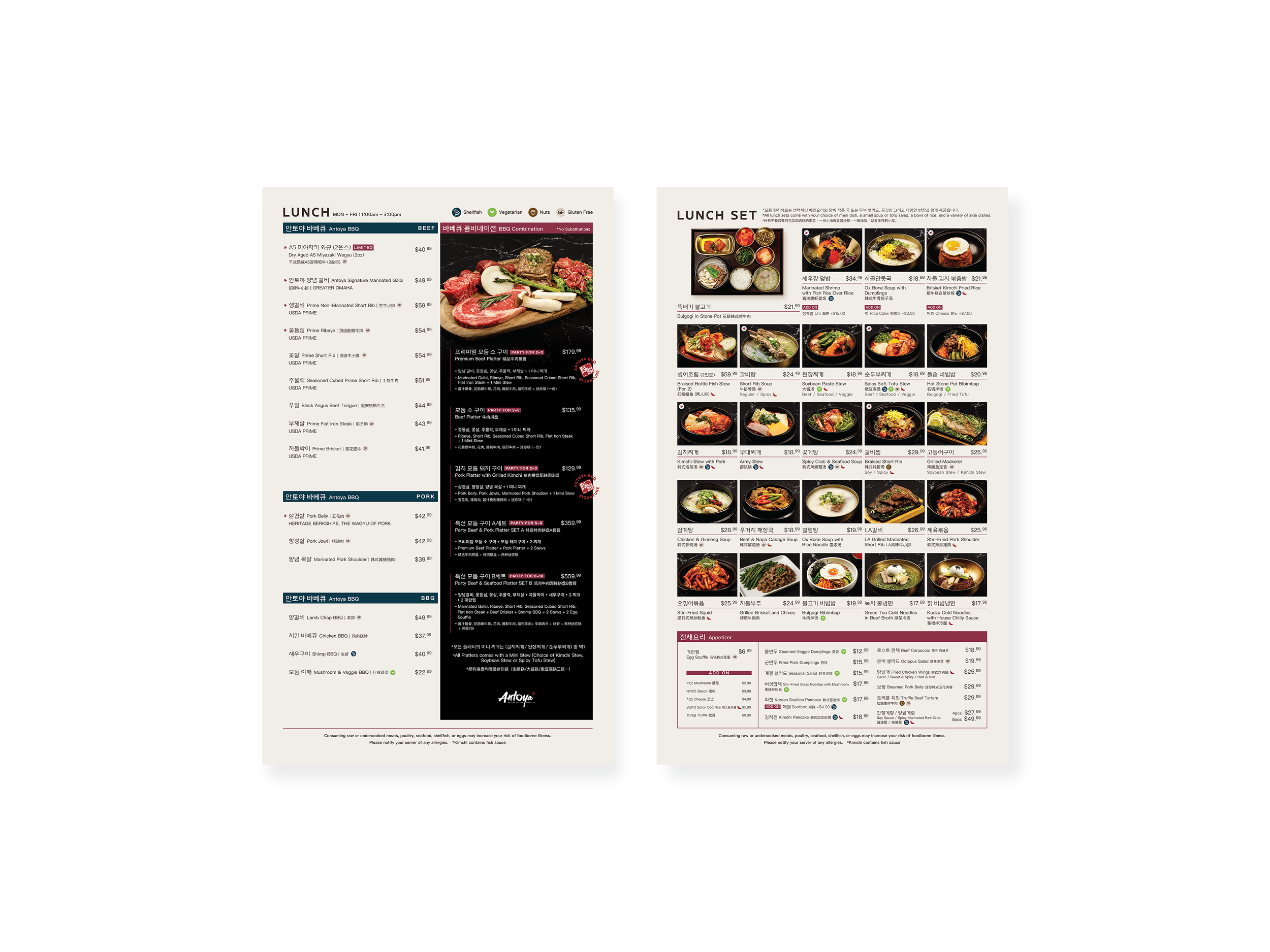
Focused on two main categories, BBQ and lunch sets, to highlight key offerings and structured the layout accordingly.
Aligned images and text consistently to display all lunch set options clearly at a glance.
Changed print paper to tabloid (8.5"x17") and adjusted the layout so the menu doesn’t appear overcrowded with images and text.