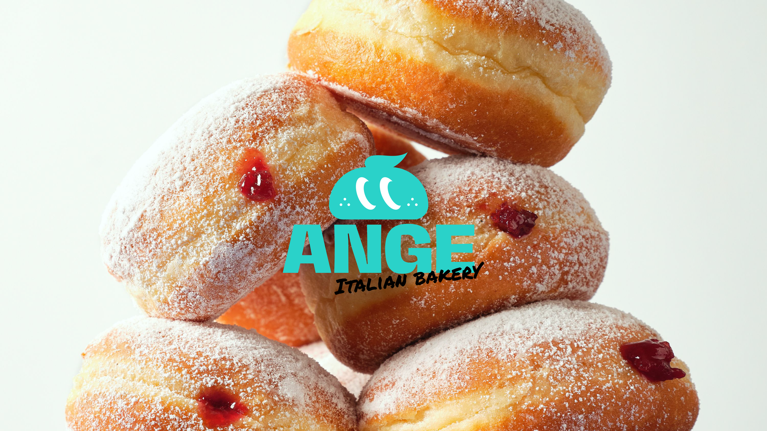
ANGE Rebranding Proposal
Angelina Italian Bakery
-
The logo alone does not immediately convey that it’s a bakery; the girl’s silhouette symbol makes it more reminiscent of a beauty or toy brand.
Currently, 90% of the brand’s core customers are European tourists; the goal is to attract a broader and more diverse customer base.
The brand name conflicts with Angelina Paris (1903), and existing agreements limit how the logo can be used.
The design appears outdated and lacks a contemporary, professional aesthetic.
-
Update the logo to a younger, more modern style to appeal to a broader audience.
Retain the essence of the existing brand while introducing something new.
➪
ANGE
-
Visualized the brand’s signature product, Bombolone (Italian Donut), so that it’s immediately clear what the brand sells.
Used a brighter, more saturated teal color, and employed high-contrast white and black alongside it to give the brand a youthful, modern feel and increase logo focus.
Transformed the girl’s silhouette from the original logo by incorporating her ponytail into the design: the cream on the Bombolone flows like the ponytail in the wind, creating a distinctive visual detail.
Considering that the brand name ‘Angelina’ feels somewhat old-fashioned, personal, and overlaps with other brands, the name was updated. Changed from ‘Angelina Italian Bakery’ to ANGE to retain brand identity while making it more unique and memorable. No Angie, No Angela, just ANGE.


