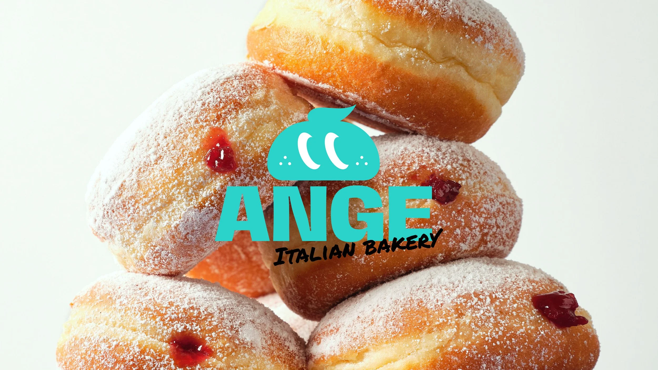
ANGE
ANGE is a brand developed as an extension of Angelina Bakery, created through a full rebranding proposal in 2026 in collaboration with QB Hospitality. The project focused on redefining the brand’s visual identity and creative direction while preserving its original spirit. It involved overseeing the end-to-end development of the brand system and applying it across all touchpoints, including menus, promotional print materials, in-store environments, and social media assets. The result is a cohesive visual language that translates the brand into a more contemporary and expanded experience across both physical and digital spaces.
Services Include
The existing branding for Angelina Bakery had several structural limitations. First, the brand name and visual identity did not immediately communicate its connection to the bakery category or its core products, resulting in a lack of intuitive recognition. In addition, the name “Angelina” carried potential overlap with an already established brand, raising concerns around distinctiveness and brand ownership.
The visual system was also overly complex, which reduced clarity and consistency across touchpoints and made it difficult to establish a strong, cohesive brand presence. Furthermore, the overall tone and visual language felt somewhat outdated in relation to the target audience, limiting its ability to position the brand as a more contemporary bakery.

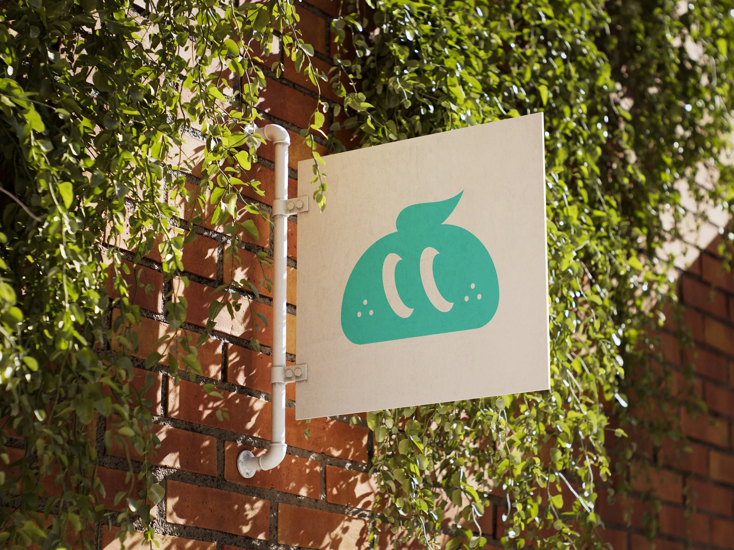
Visual Identity 
To address these issues, I redefined the brand system with a focus on clarity and immediacy. The visual language was simplified to create a more direct association with the bakery category, while the structure was reorganized to highlight a more product-led brand experience.
I also reworked the relationship between the brand name and its visual elements to build a more distinct and cohesive identity. Complex and inconsistent graphic elements were streamlined into a unified system, ensuring a consistent brand expression across multiple touchpoints.
Finally, the overall tone and aesthetic direction were updated to feel more modern and aligned with the target audience, resulting in a clearer, more memorable, and more relevant brand experience.